Overview
Mamoru redefines traditional financial services through cutting-edge technology. We recognized the need for advanced and efficient financial solutions that could keep up with the rapidly evolving financial markets. Our mission is to provide you with the most accessible and trusted access to the global financial market.
My Role
As a UI/UX Designer, I am dedicated to creating intuitive and engaging user experiences that seamlessly blend functionality with aesthetics. My role involves conducting user research to understand needs and behaviors, developing wireframes and prototypes, and collaborating closely with developers and stakeholders to bring designs to life. I focus on crafting user-centered designs that enhance usability and accessibility, ensuring that every interaction is smooth and satisfying. With a keen eye for detail and a passion for innovation, I strive to elevate the user journey, making digital products not only visually appealing but also highly effective.
Design Solutions
Challenges |
Solutions |
|---|---|
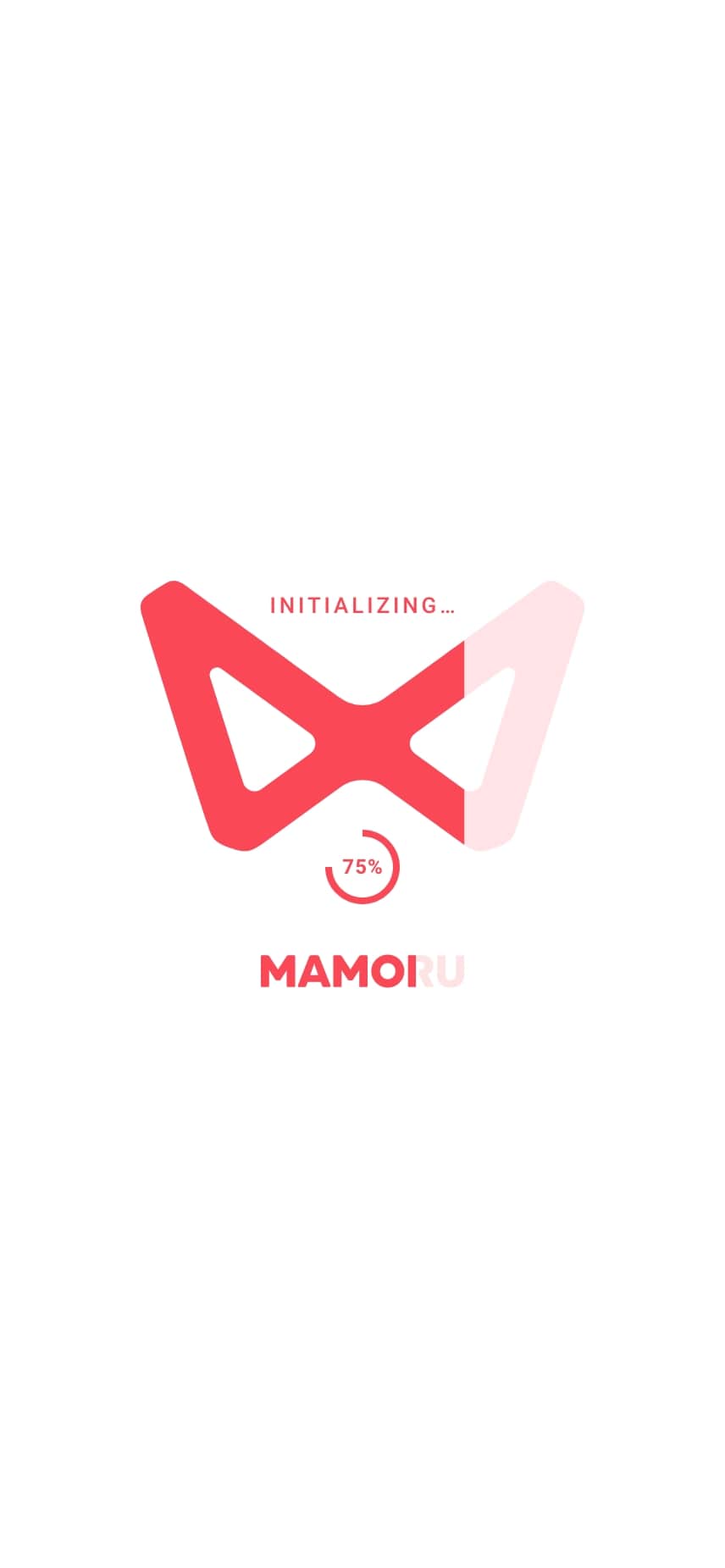
| User Patience Users may become impatient while waiting, especially in trading apps where timely information is crucial. |
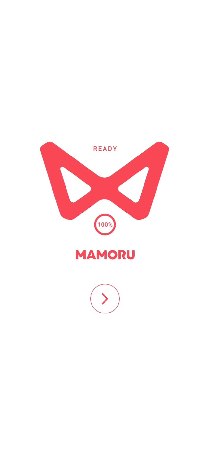
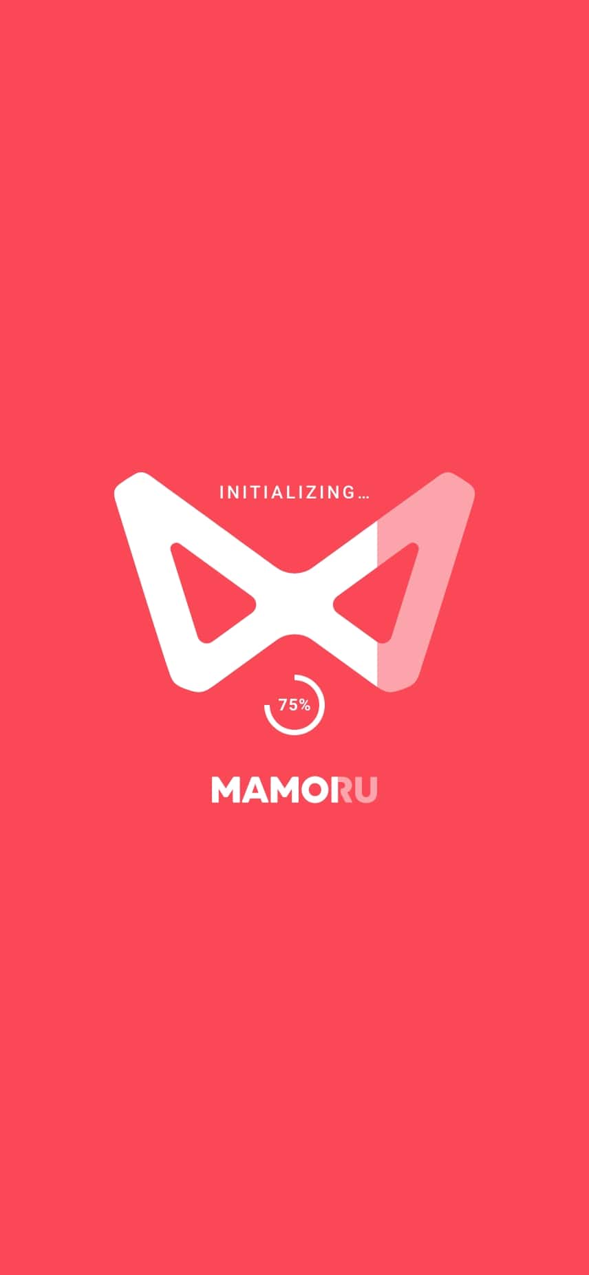
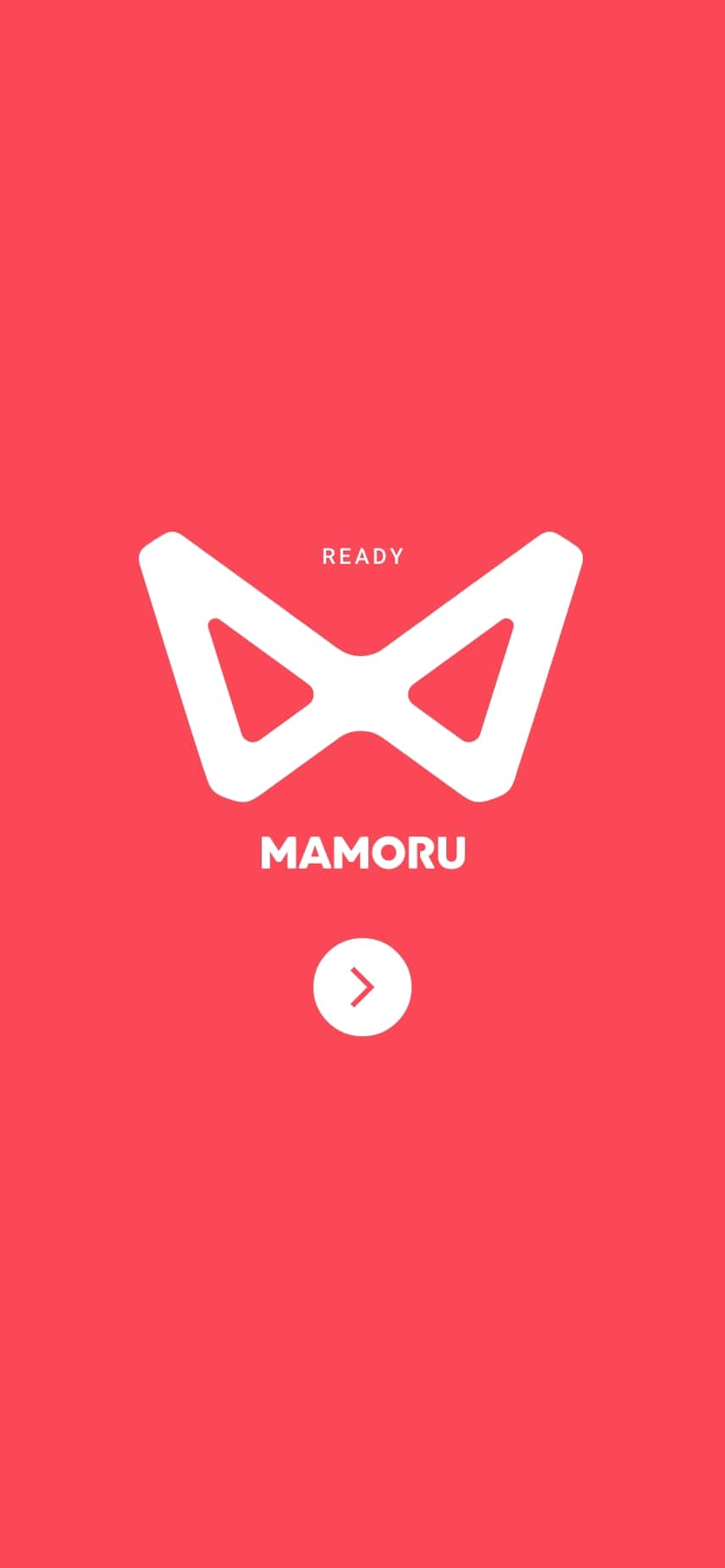
Minimalist Design Implement a minimalist and streamlined design for the preloader, featuring a percentage loading status indicator. |
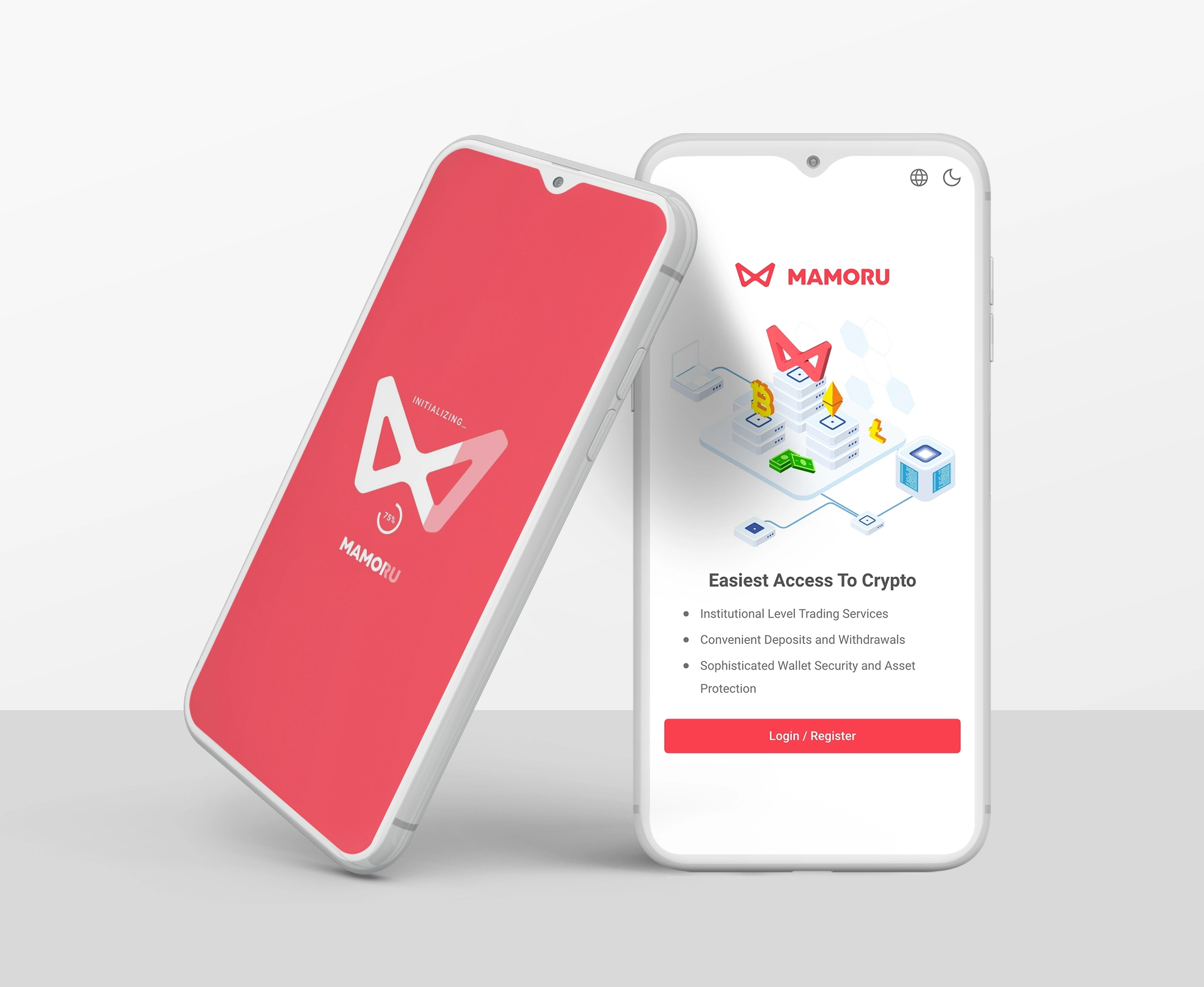
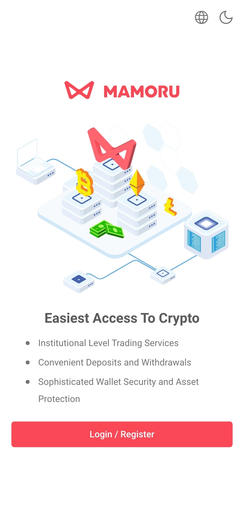
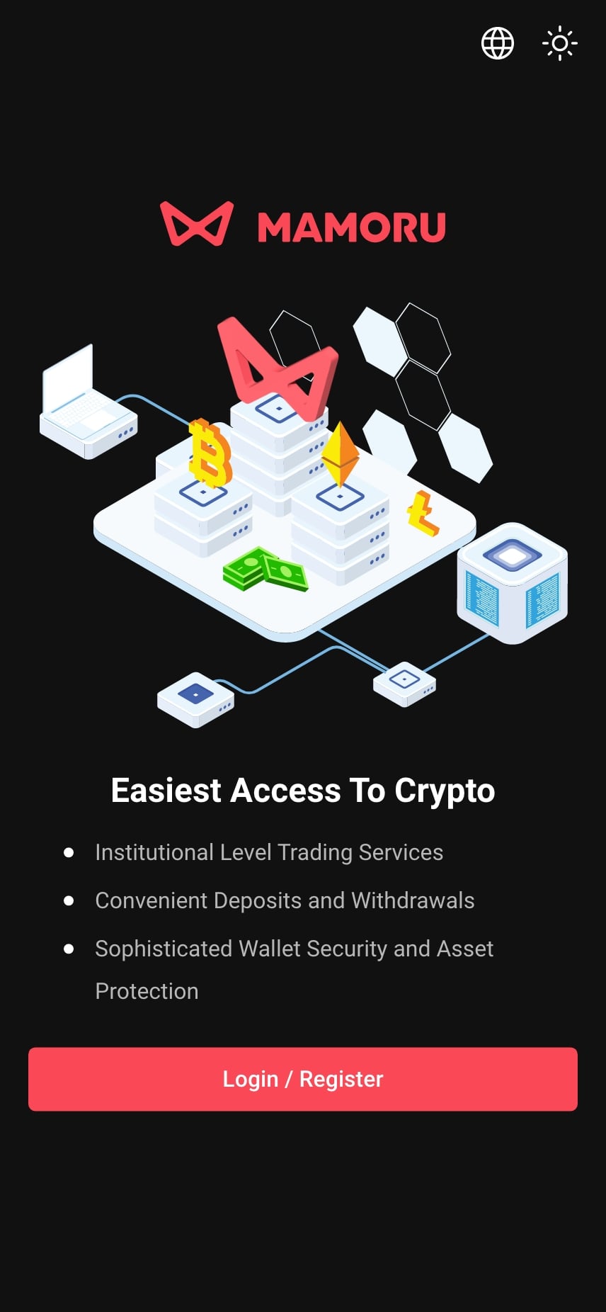
| Presenting Features on the Introduction Screen Users may feel overwhelmed by too many features, leading to disengagement. |
Concise & Engaging Feature Presentation Highlight the top three to five features with brief, clear descriptions. |
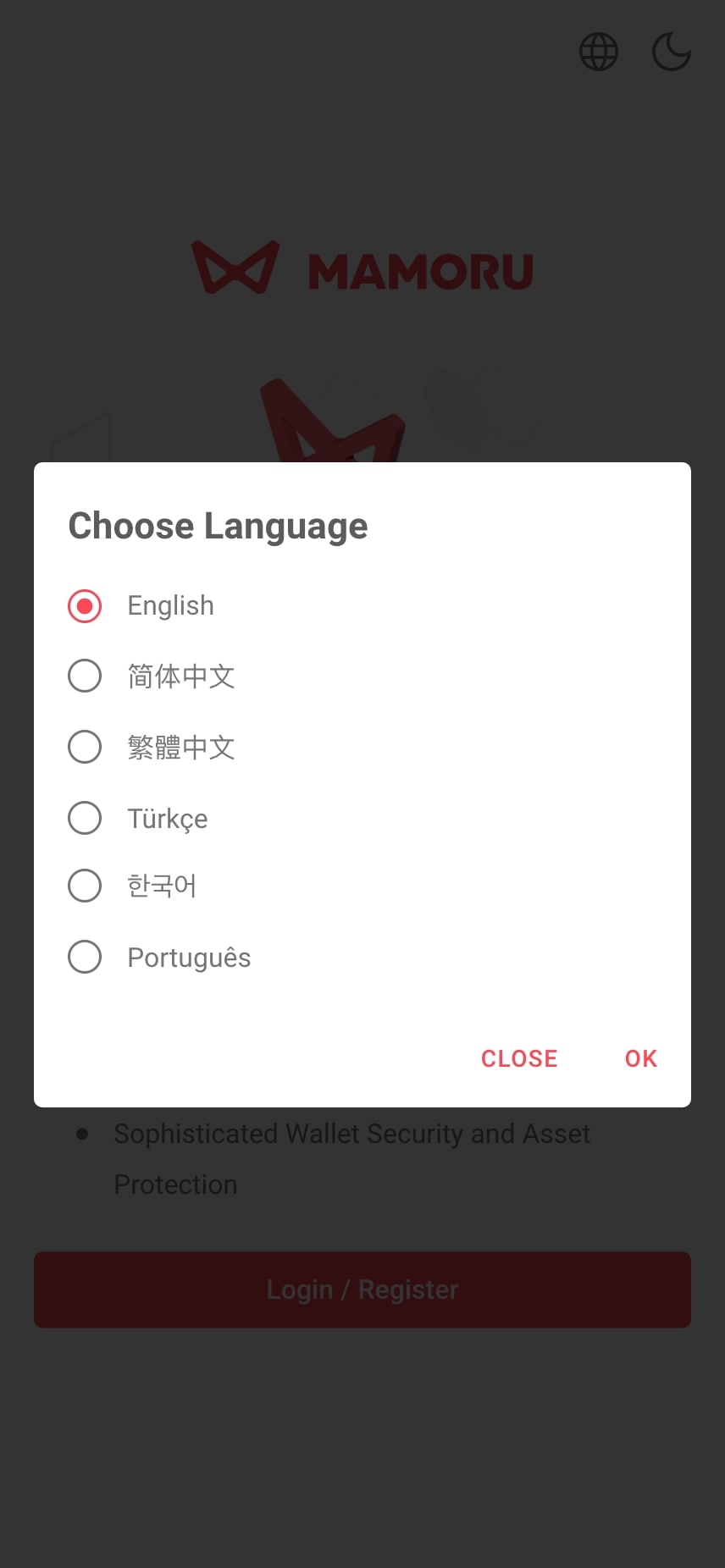
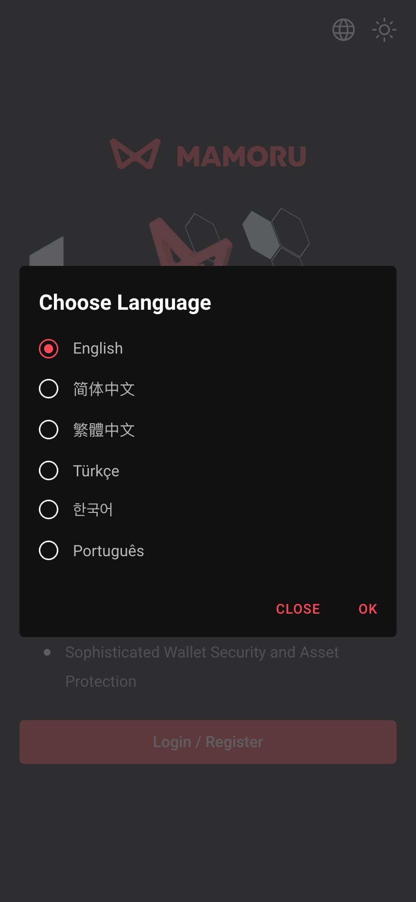
| Language Accessibility Users who are not familiar with the default language may find it difficult to navigate and understand the app, leading to frustration and potential drop-off. |
Language Selection Modal Introduce a language selection modal, allowing users to choose their preferred language easily. The app will remember preferences and may suggest a default based on geolocation, enhancing inclusivity and satisfaction. |
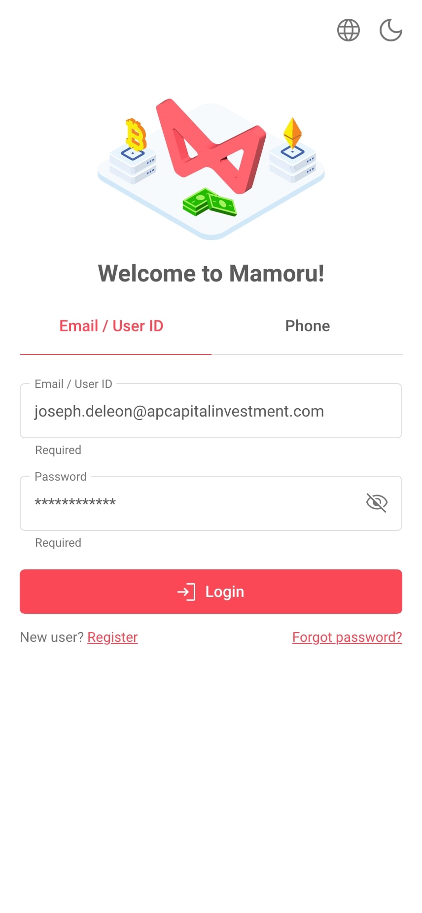
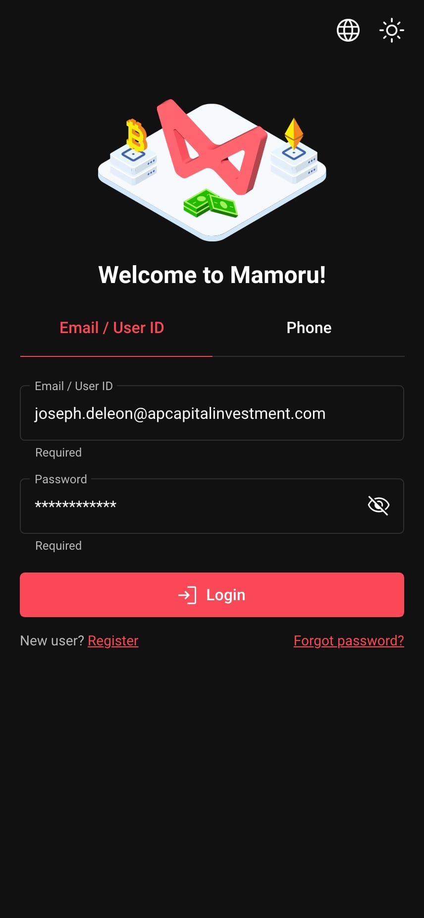
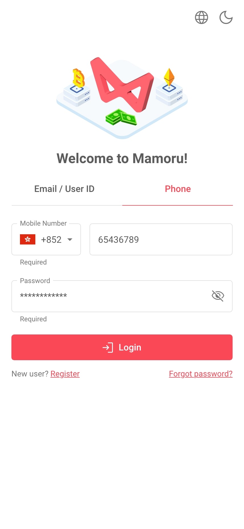
| Log In Input Confusion Users may struggle to differentiate between the email/username and phone number login methods. |
Streamlining Login with Tabbed Options Implementing a tab component to separate the email/username and phone could further streamline the process, allowing users to easily switch between their preferred login method. |
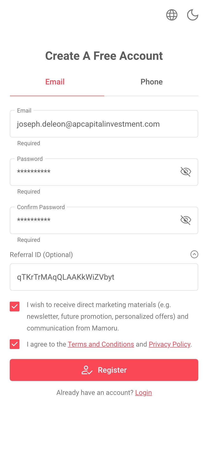
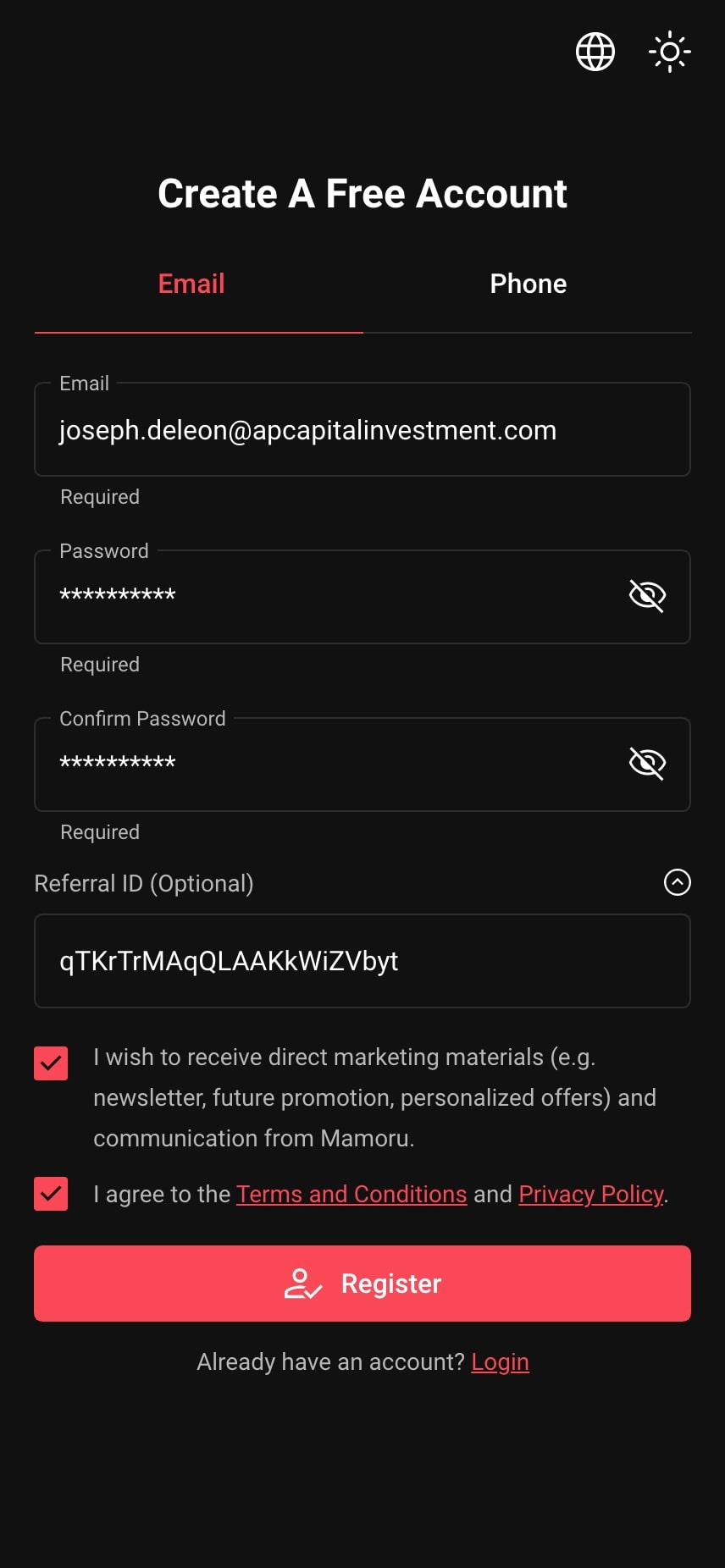
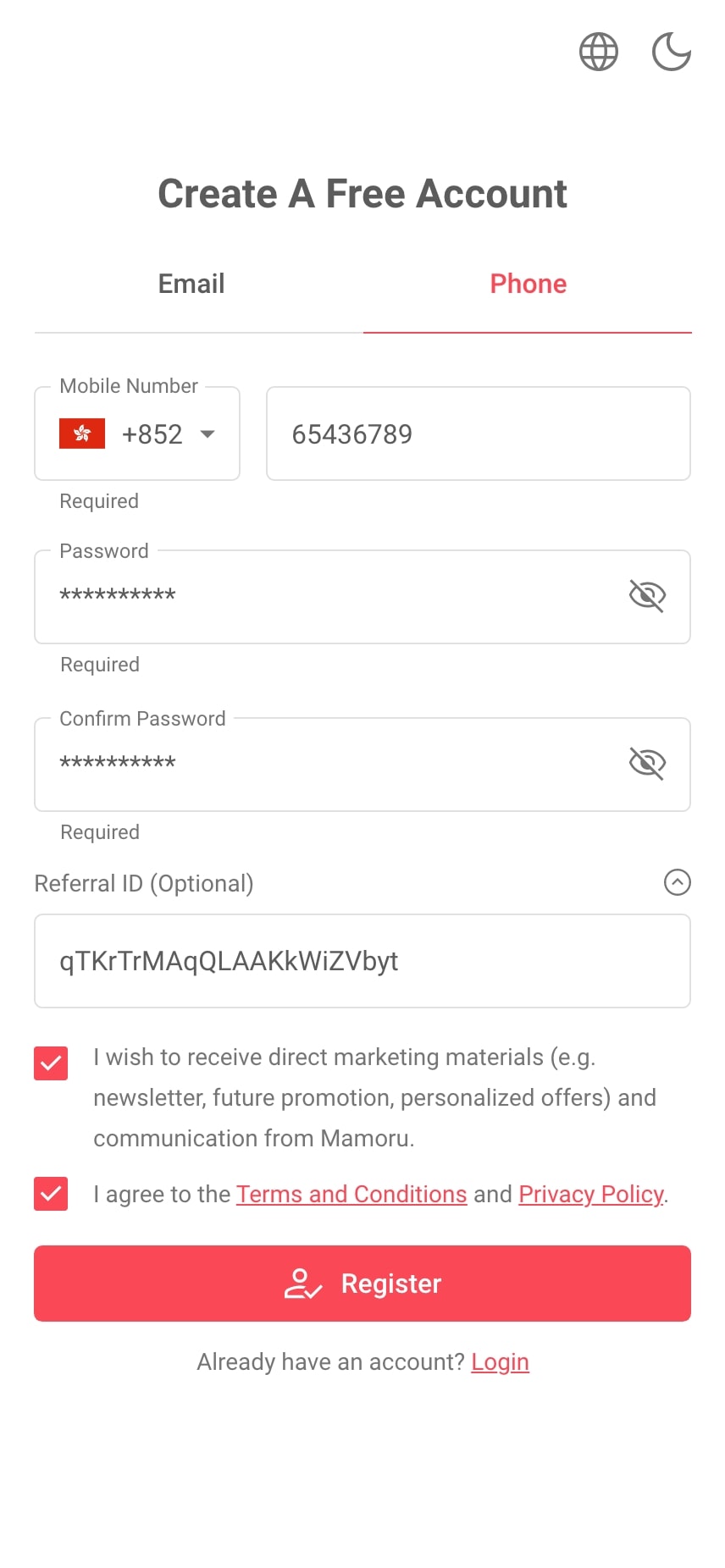
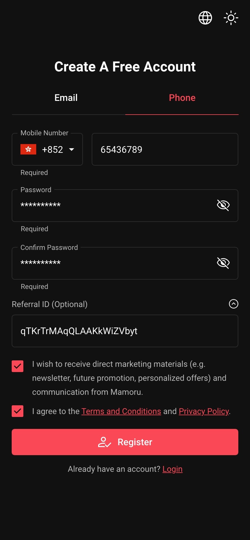
| Confusion in Registration Options Users often feel confused about where they can use their email address or phone number to register in the mobile app. |
Tab Component for Registration Clarity Implement a tab component at the top of the registration screen. This component should clearly distinguish between the email and phone number registration methods. |
| Overwhelmed by Disorganized Content Users feel confused and overwhelmed by disorganized content on each screen, leading to frustration and abandonment of the mobile app. |
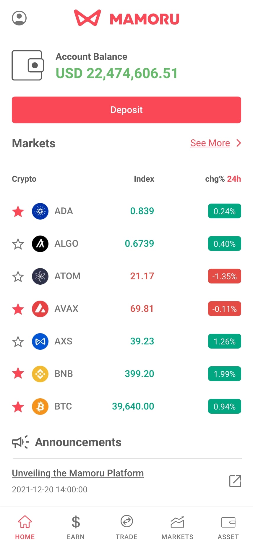
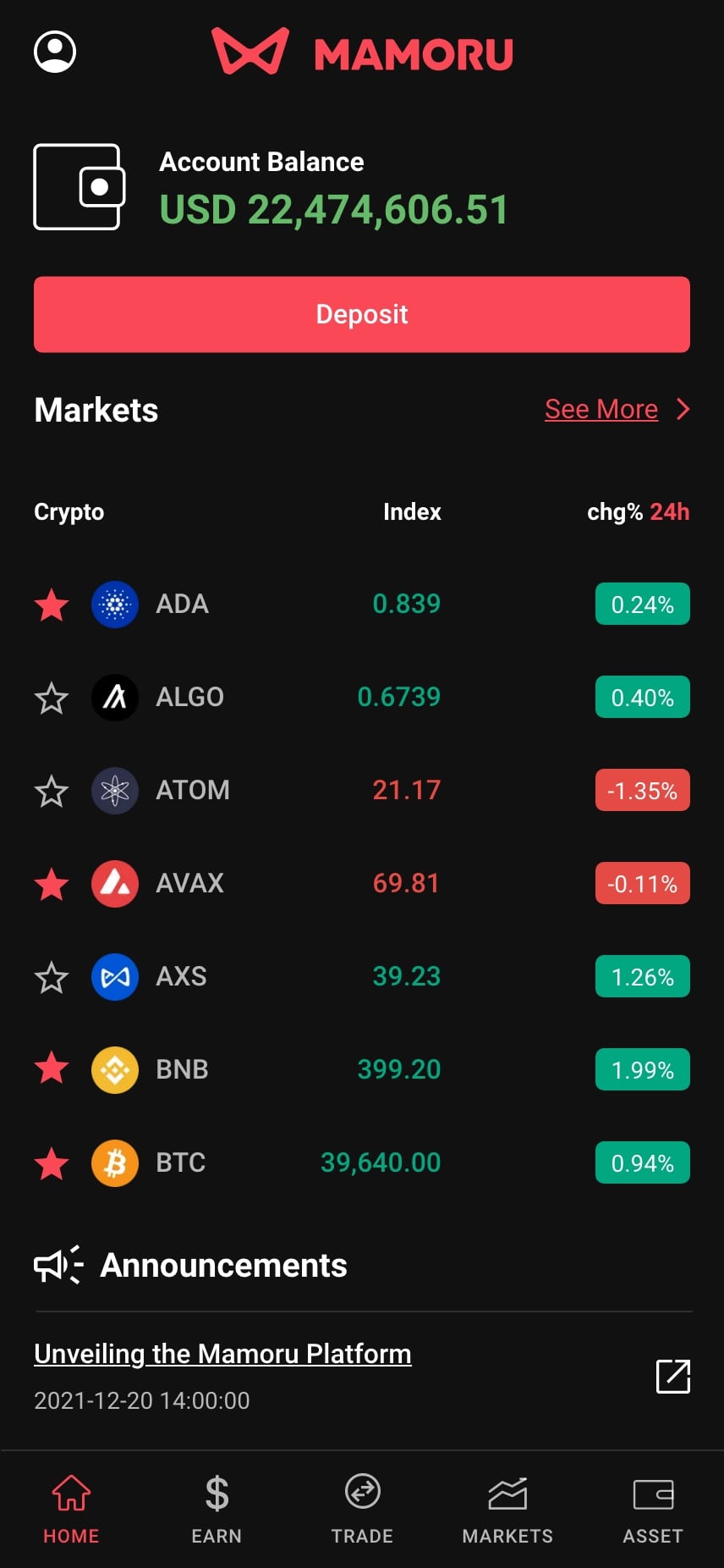
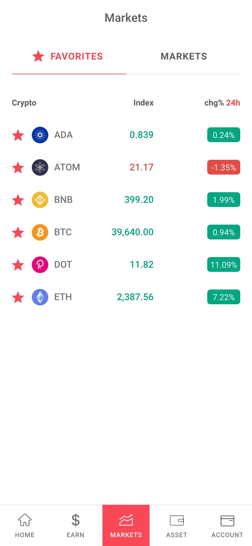
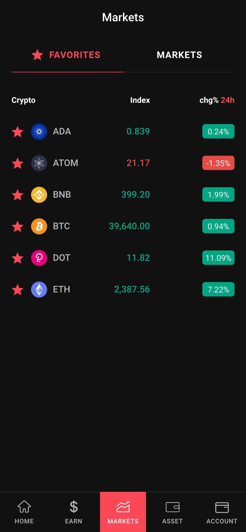
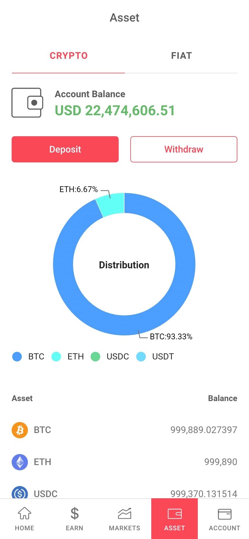
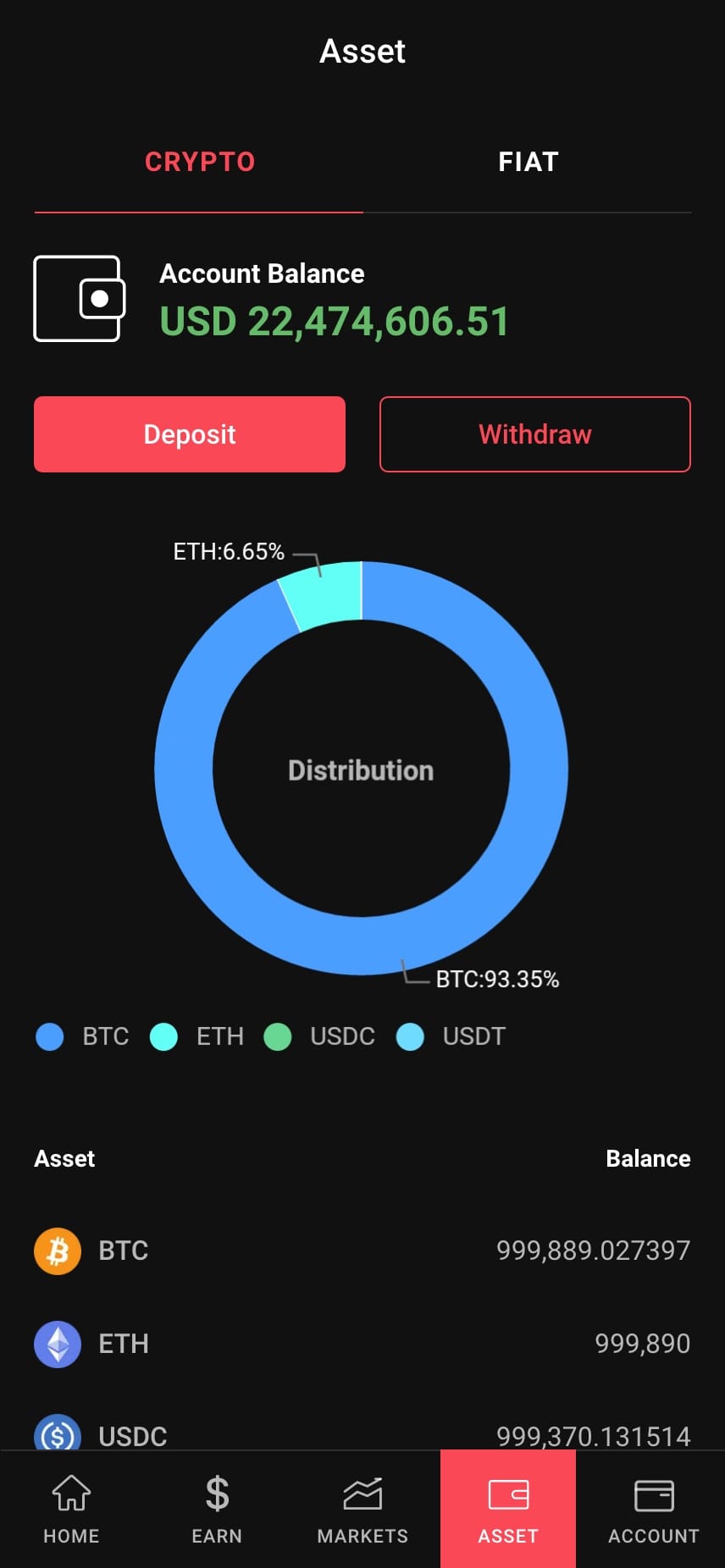
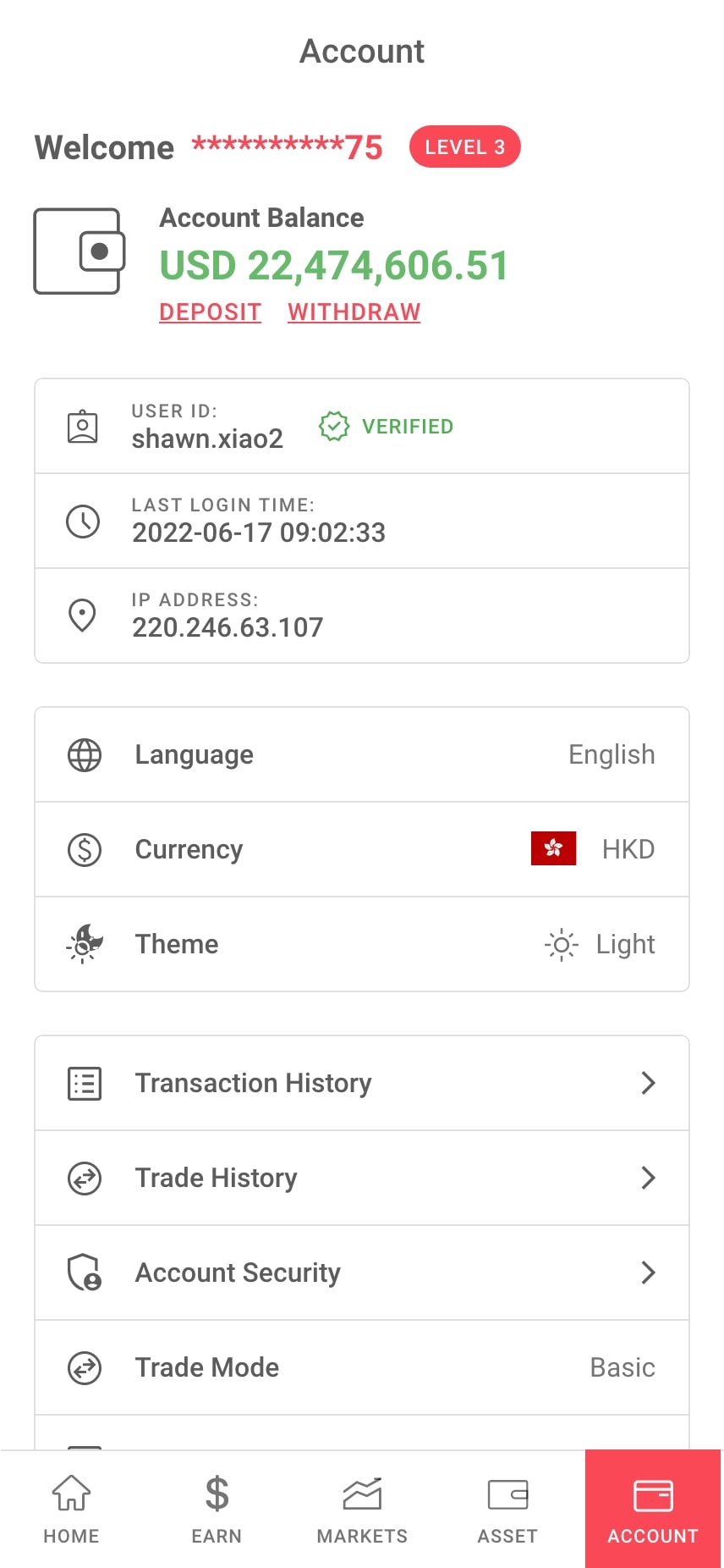
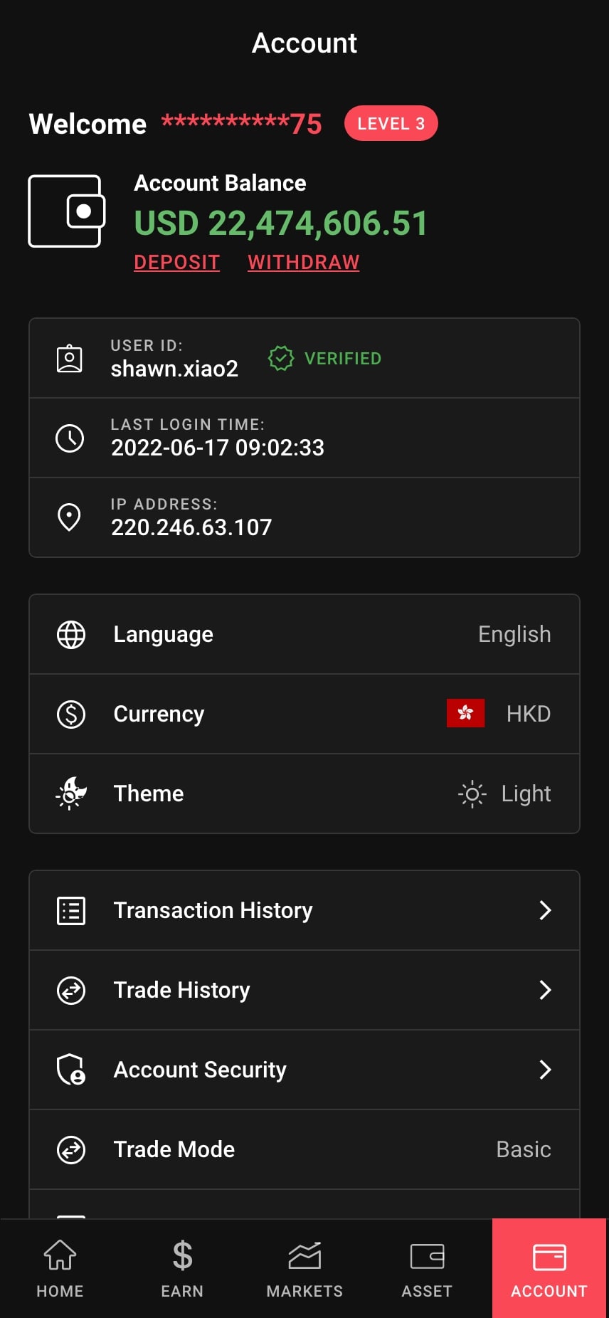
Simplified Navigation Implement a clear and intuitive navigation structure with a bottom navigation bar or a side menu that categorizes content logically, allowing users to easily find what they need. |
Minimalist Design
Implement a minimalist and streamlined design for the preloader, featuring a percentage loading status indicator.
Concise & Engaging Feature Presentation
Highlight the top three to five features with brief, clear descriptions.
Language Selection Modal
Introduce a language selection modal, allowing users to choose their preferred language easily. The app will remember preferences and may suggest a default based on geolocation, enhancing inclusivity and satisfaction.
Streamlining Login with Tabbed Options
Implementing a tab component to separate the email/username and phone could further streamline the process, allowing users to easily switch between their preferred login method.
Tab Component for Registration Clarity
Implement a tab component at the top of the registration screen. This component should clearly distinguish between the email and phone number registration methods.
Simplified Navigation
Implement a clear and intuitive navigation structure with a bottom navigation bar or a side menu that categorizes content logically, allowing users to easily find what they need.