Overview
At iSHANG, we are pioneers in the evolution from Web2 to Web3, dedicated to helping brands and enterprises navigate this transformative journey. Our team is passionate about revolutionizing traditional methods of brand engagement, customer acquisition, and retention, ensuring that our clients not only adapt but thrive in the decentralized landscape.
My Role
As a UI/UX Designer, I am dedicated to creating intuitive and engaging user experiences that seamlessly blend functionality with aesthetics. My role involves conducting user research to understand needs and behaviors, developing wireframes and prototypes, and collaborating closely with developers and stakeholders to bring designs to life. I focus on crafting user-centered designs that enhance usability and accessibility, ensuring that every interaction is smooth and satisfying. With a keen eye for detail and a passion for innovation, I strive to elevate the user journey, making digital products not only visually appealing but also highly effective.
Design Solutions
Challenges |
Solutions |
|---|---|
| Disorganized Content Layout The old Web3 website has a cluttered appearance with disorganized content. |
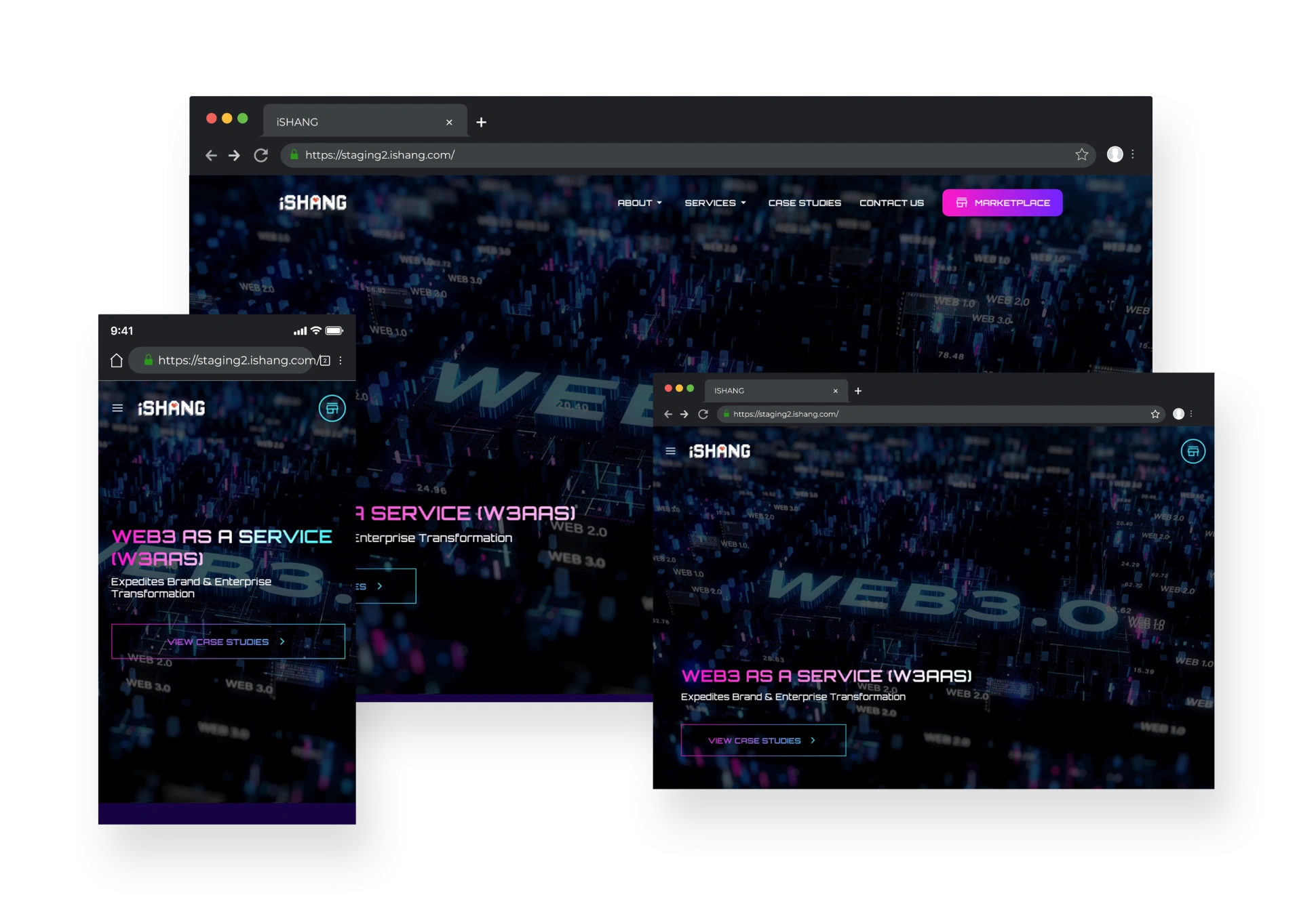
Modernize Layout: Enhance Clarity & Organization Redesign the layout with a clean, modern aesthetic. Use clear headings, subheadings, and visual hierarchy to improve content organization. |
| Overwhelming Single-Page Format All content is displayed on a single page, making it overwhelming for users. |
Streamline Navigation: Organize Content for Easy Access Divide content into multiple pages or sections based on themes or topics. Implement a tiered navigation menu to allow users to easily access different sections of the site. |
| Lack of Clarity About iSHANG's Services Users are confused about what iSHANG is and the services it offers. |
Clarify Offerings: Enhance 'About Us' & 'Services' Pages Create a dedicated "About Us" and "Services" page with clear, concise descriptions of the company and its offerings. Use visuals, such as icons or infographics, to illustrate services. |
| Overwhelming Case Studies Presentation Case studies are too detailed and overwhelming. |
Simplify Case Studies: Use Tabs for Clear, Engaging Display Implement a tab component to display case studies. This allows users to view one case study at a time without feeling overwhelmed. Ensure that case studies are visually appealing with images. |
| Absence of a Contact Form There is no contact form for user inquiries. |
Enhance Communication: Create a User-Friendly Contact Form Implement a user-friendly contact form. Ensure the form includes essential fields (name, email, message) and a clear call-to-action. |
| Difficult Navigation on Mobile Devices Users find it hard to navigate the website on mobile. |
Mobile Optimization: Adopt a Responsive, Space-Saving Design Optimize the design for mobile responsiveness with a mobile-first approach. Use a collapsible navigation menu (hamburger menu) to save space. |
Modernize Layout: Enhance Clarity & Organization
Redesign the layout with a clean, modern aesthetic. Use clear headings, subheadings, and visual hierarchy to improve content organization.
Streamline Navigation: Organize Content for Easy Access
Divide content into multiple pages or sections based on themes or topics. Implement a tiered navigation menu to allow users to easily access different sections of the site.
Clarify Offerings: Enhance 'About Us' and 'Services' Pages
Create a dedicated "About Us" and "Services" page with clear, concise descriptions of the company and its offerings. Use visuals, such as icons or infographics, to illustrate services.
Simplify Case Studies: Use Tabs for Clear, Engaging Display
Implement a tab component to display case studies. This allows users to view one case study at a time without feeling overwhelmed.
Enhance Communication: Create a User-Friendly Contact Form
Implement a user-friendly contact form. Ensure the form includes essential fields (name, email, message) and a clear call-to-action.
Mobile Optimization: Adopt a Responsive, Space-Saving Design
Optimize the design for mobile responsiveness with a mobile-first approach. Use a collapsible navigation menu (hamburger menu) to save space.