Overview
Inaugurated in Hong Kong in 2020, TADS Awards, is the World's first annual international awards for Tokenized Assets and Digitized Securities (“TADS”) sector. It celebrates the TADS sector by recognizing and honouring significant contributions and distinguished achievements worldwide.
My Role
As a UI/UX Designer, I am dedicated to creating intuitive and engaging user experiences that seamlessly blend functionality with aesthetics. My role involves conducting user research to understand needs and behaviors, developing wireframes and prototypes, and collaborating closely with developers and stakeholders to bring designs to life. I focus on crafting user-centered designs that enhance usability and accessibility, ensuring that every interaction is smooth and satisfying. With a keen eye for detail and a passion for innovation, I strive to elevate the user journey, making digital products not only visually appealing but also highly effective.
Design Solutions
Challenges |
Solutions |
|---|---|
| Aesthetic Design Issues The current website lacks a cohesive and appealing visual design, which detracts from user engagement and overall user experience. |
Enhance Visual Design Implement a modern, visually appealing design that aligns with the brand identity, improving user engagement and aesthetic appeal. |
| Content Organization The site features disorganized content, making it difficult for users to navigate and find relevant information. Additionally, repetitive content across multiple pages leads to confusion and frustration. |
Improve Content Structure Develop a clear content hierarchy and navigation system to streamline access to information, reducing redundancy and enhancing the user experience. |
| Nomination Form Usability The nomination form is unintuitive, requiring users to navigate between multiple pages. This fragmented experience hinders users from completing the form efficiently. |
Streamline Nomination Process Redesign the nomination form to allow for a single-page experience using a tab component, minimizing navigation and simplifying the submission process for users. |
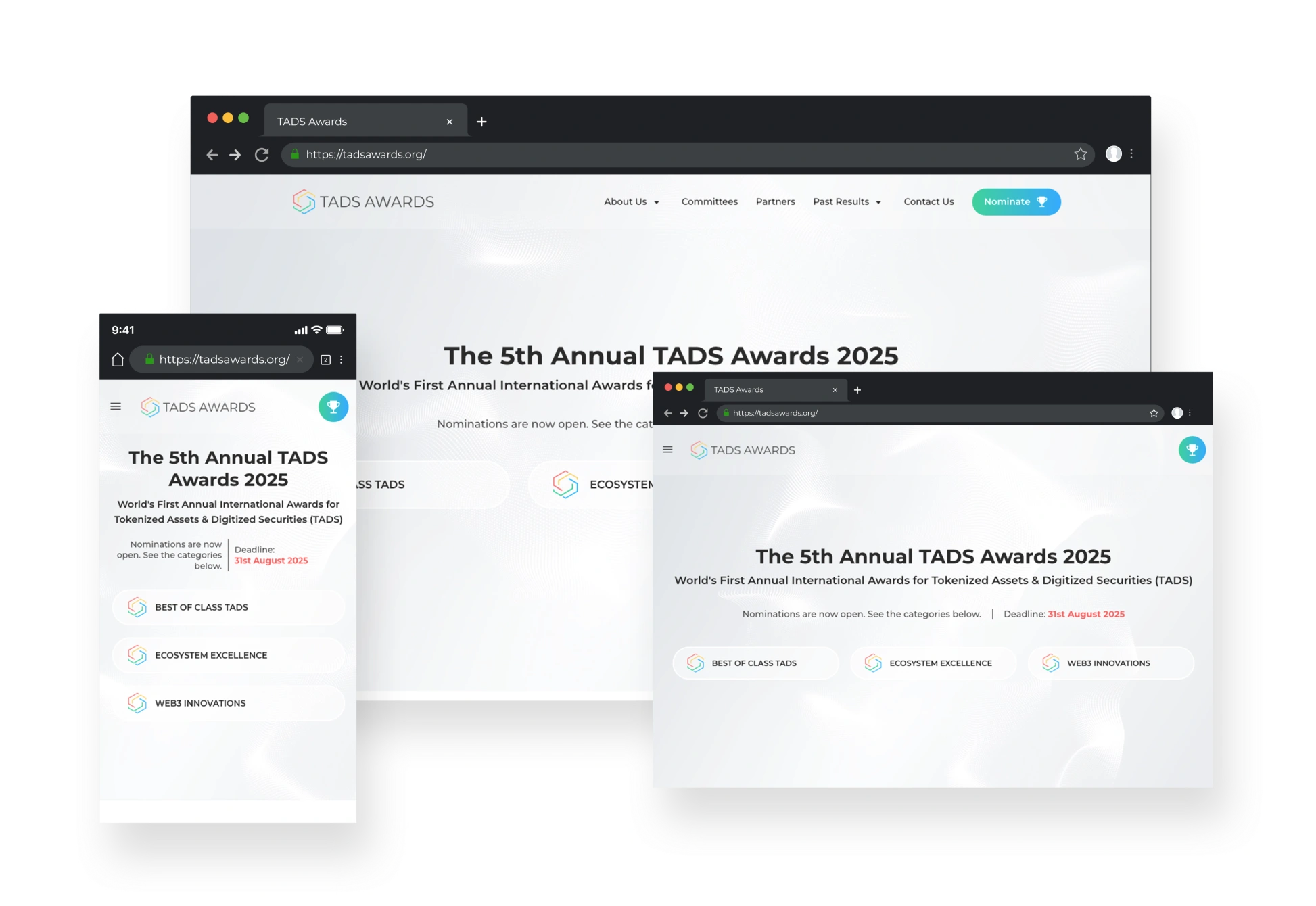
| Poor Responsiveness The website does not adapt well to different screen sizes, negatively impacting usability on mobile and tablet devices. |
Optimize for Responsiveness Ensure the website is fully responsive, providing an optimal viewing experience across all devices and screen sizes. |
| Overlapping Content Layout The committees and partners' information are presented on the same page, resulting in excessive scrolling and making it challenging for users to digest the content effectively. |
Separate Content Sections Create distinct pages or sections for committees and partners to reduce scrolling and improve content digestibility by implementing a tab component. |
| Confusing Results Presentation The nomination results are difficult to understand, leading to a lack of clarity for users attempting to analyze the outcomes. |
Clarify Results Presentation Redesign the presentation of nomination results to enhance clarity and usability, enabling users to easily analyze and interpret the information. |
Enhance Visual Design
Implement a modern, visually appealing design that aligns with the brand identity, improving user engagement and aesthetic appeal.
Improve Content Structure
Develop a clear content hierarchy and navigation system to streamline access to information, reducing redundancy and enhancing the user experience.
Streamline Nomination Process
Redesign the nomination form to allow for a single-page experience using a tab component, minimizing navigation and simplifying the submission process for users.
Optimize for Responsiveness
Ensure the website is fully responsive, providing an optimal viewing experience across all devices and screen sizes.
Separate Content Sections
Create distinct pages or sections for committees and partners to reduce scrolling and improve content digestibility by implementing a tab component.
Clarify Results Presentation
Redesign the presentation of nomination results to enhance clarity and usability, enabling users to easily analyze and interpret the information.